I wanted to create a logo that is unapologetically ME:
Round shapes
Feminine/Witchy
Clean
Smart
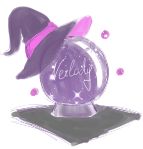
The idea of using a crystalball for it came easy and during the same time I worked on Celia so I was able to use some assets from her again for my Logo, giving it a sense of belonging together and both being part of me!
So first I made a sketch to get my idea on paper and then I created a clean draft in After Effects.
Animation draft
Wanting to give myself a first impression of how the animation should actually look when done, I quickly made the simplest of animations in After Effects, getting a grasp of the movement I want to achieve.
The Nova at the end was scrapped afterwards since it didn’t fit the otherwise clean imagery and was just recycled material from After effects practices I thought I could put to use.
Building Assets
After finding out what I strive for with this animation, I started getting more specific within After Effects.
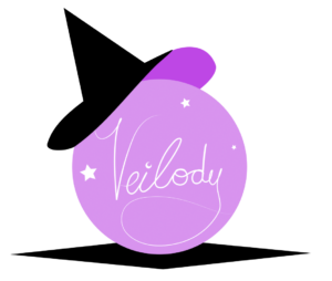
Fading the crystalball in more based on the flow I wanted to create, rather than with the mere outline and just revealing at the end it’s a ball already helped a lot.
To get a better contrast to the purposely dark background I changed the colour from purple to a pinkish violet.
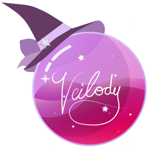
Now working with the flow I wanted some magic to happen within it, so I used my graphic tablet and drew a straightforward animation, that’s supposed to look like magic has just build up within the crystalball.
I still wanted to get a clean look to achieve a consistent look of the Logo. So I traced my sketch with the shape tool within After Effects and thus created a more clean look of the movement.
During my first attempt of translating the shape I was working chronologically, which meant I included more handles during the process which ABSOLUTELY killed the animation.
After talking with my prof he mentioned I should start with the biggest shape first and then animate into both direction, so I don’t mess up the count of the handles during the animation.
It still wasn’t as smooth as I would’ve liked it but I could work with it and move to the next step.
In Illustrator I created a path for my sign, which I imported into After effects to make a path animation out of it.
Since the „V“ and the „eilody“ were separate in the path I had to create a good timing so the animation would still look smooth.
I also used a particle effect, which traced the path first to create the feeling as if magic or just mere sparkles create the curls of my handwriting.
When I wasn’t to happy about the look of the crystalball I made before, a classmate suggested an Illustrator tutorial to me, as it reminded her of my project. It helped me a lot to find new techniques within AI and truly matched the aesthetic I wanted to achieve!
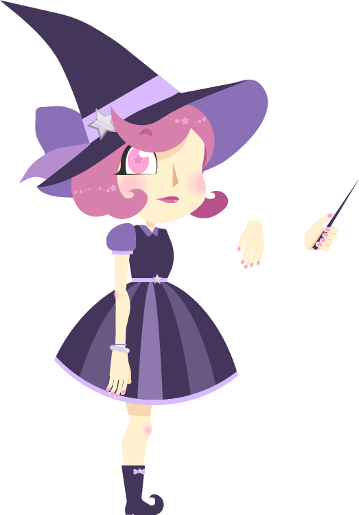
For the composition of the Logo itself I took the hat from my other project „Walkcycle – Celia“ which I made in the same semester and -with slight changes to the colours- used it for the logo as well.